Scoping is a design decision
Knowing when to stop redesigning and start delivering, especially under time constraints was one of the most valuable things I learned from this project.
Ardor is an AI-powered fitness app that acts as a personalized training companion, designed to predict a user's strength, speed, and aerobic capacity to create tailored daily workouts.
Mobile Experience and Interface Redesign
UX/UI Designer
2025
I conducted a heuristic evaluation of the app to identify usability issues that could impact the user experience. By systematically analyzing key screens against Nielsen's 10 usability heuristics, this study surfaced friction points around feedback, consistency, and user control that would otherwise go unnoticed without formal testing.
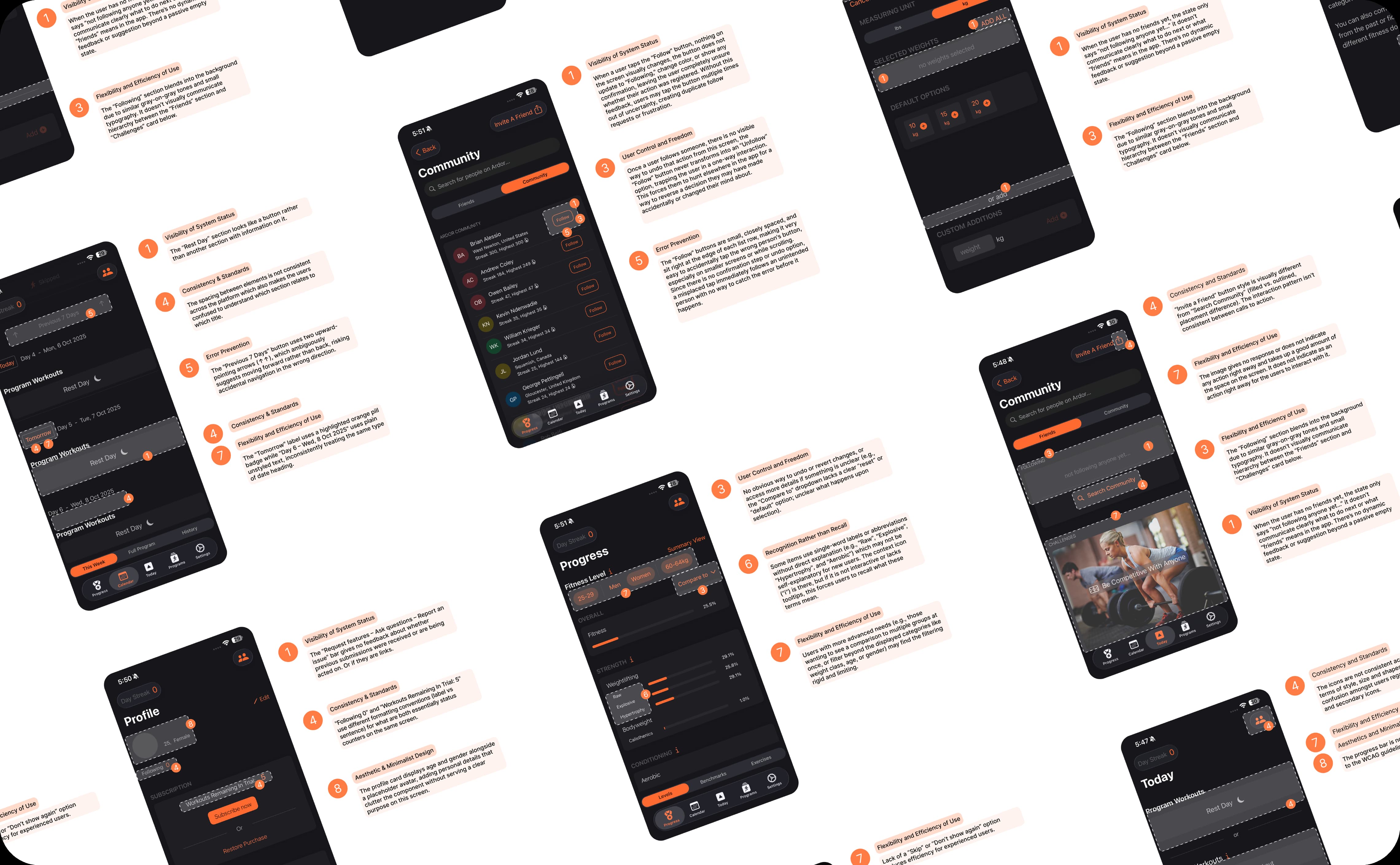
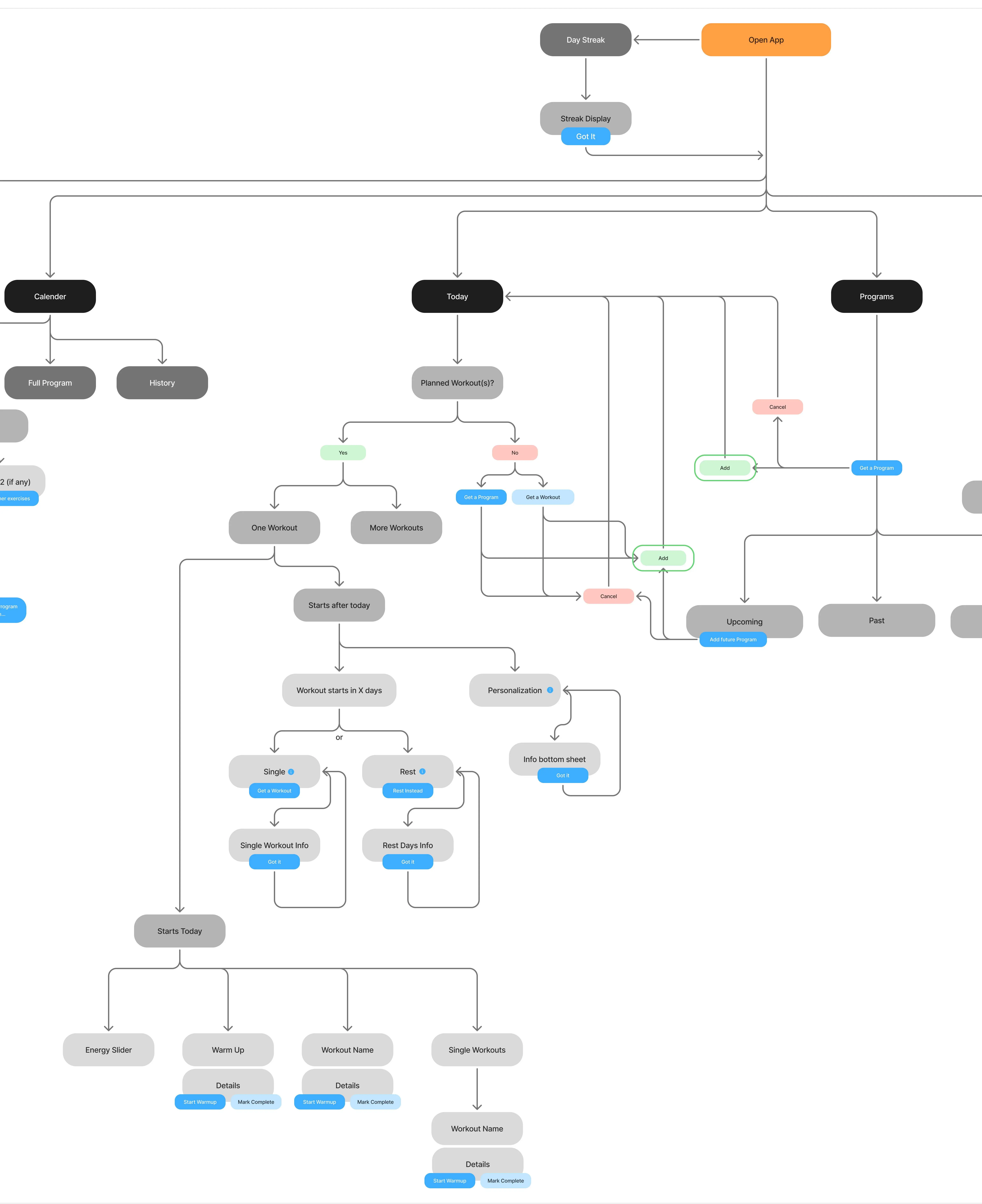
I designed the Information Architecture to establish a logical content hierarchy and navigation model for the app. I also identified breakdowns in existing user flows and reworked the structure to create more efficient and user-friendly pathways

The biggest challenge was taming the IOS 26 liquid glass effect, balancing translucency and depth without it competing with Ardor's warm, energetic brand. I fine-tuned the white channel opacity and directional chrome edges across six variants to make the glass feel native to the app, not borrowed from the system.
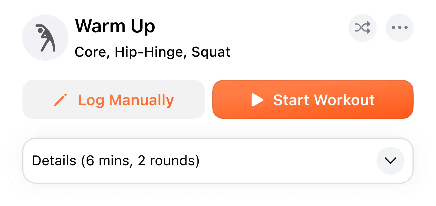
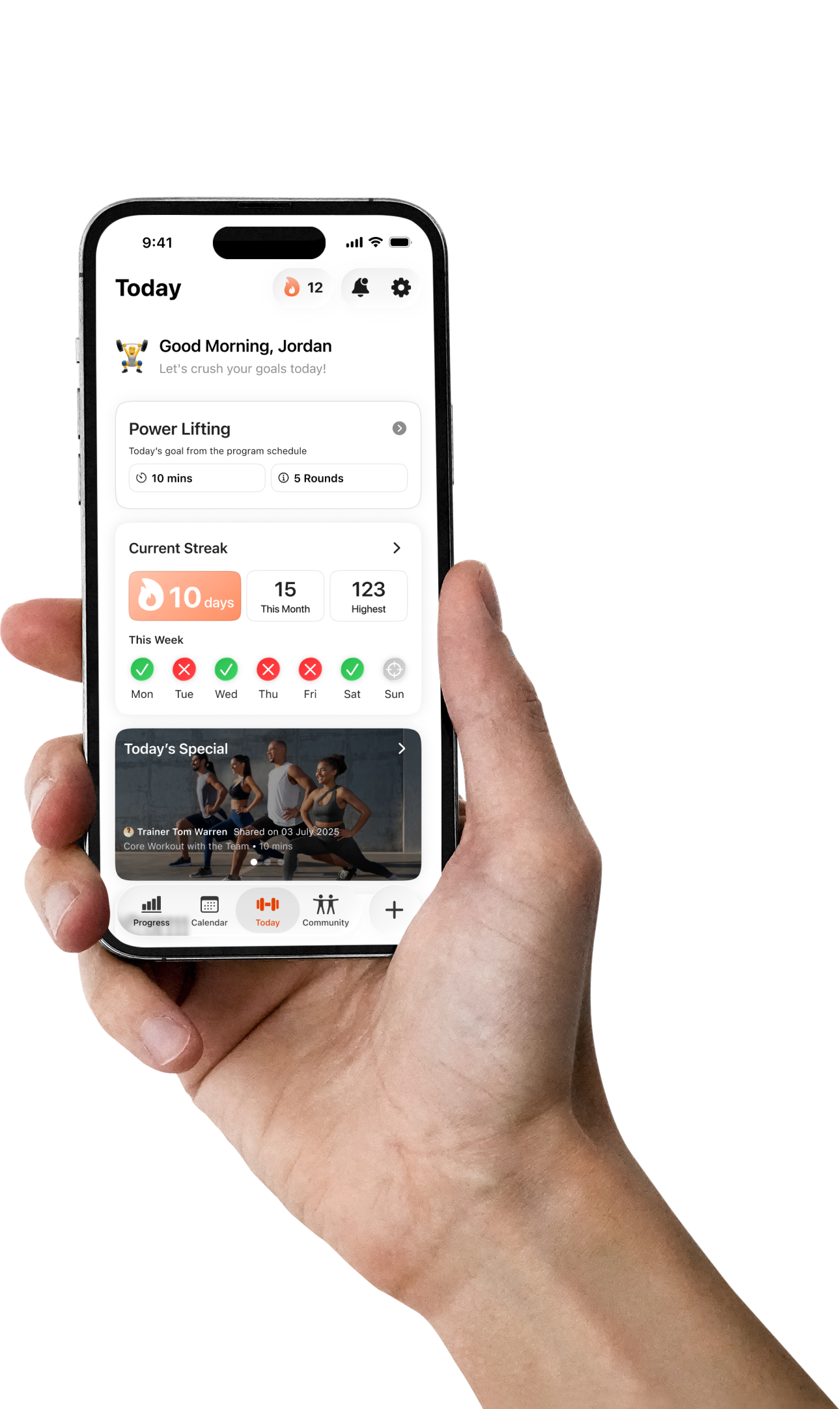
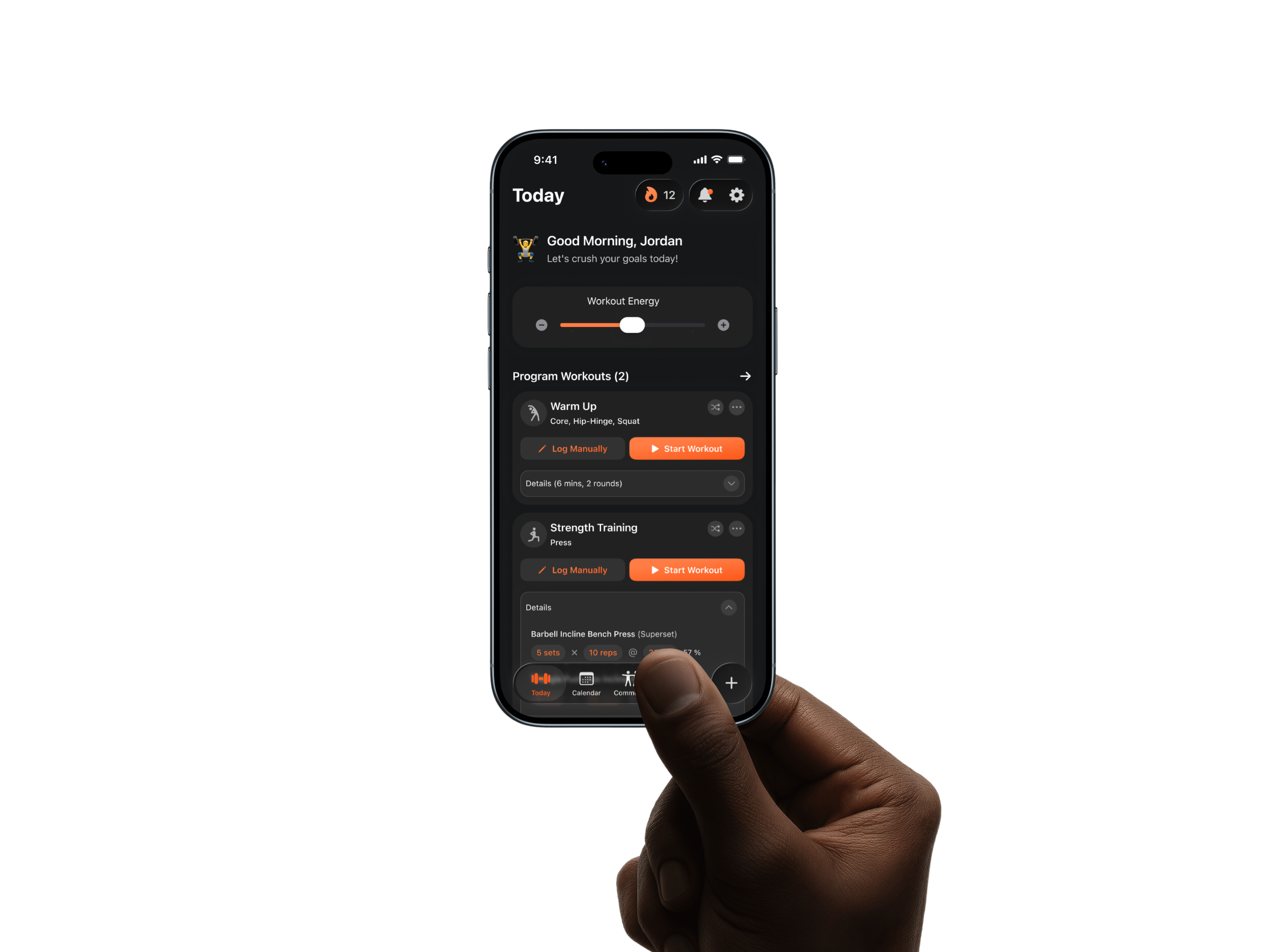
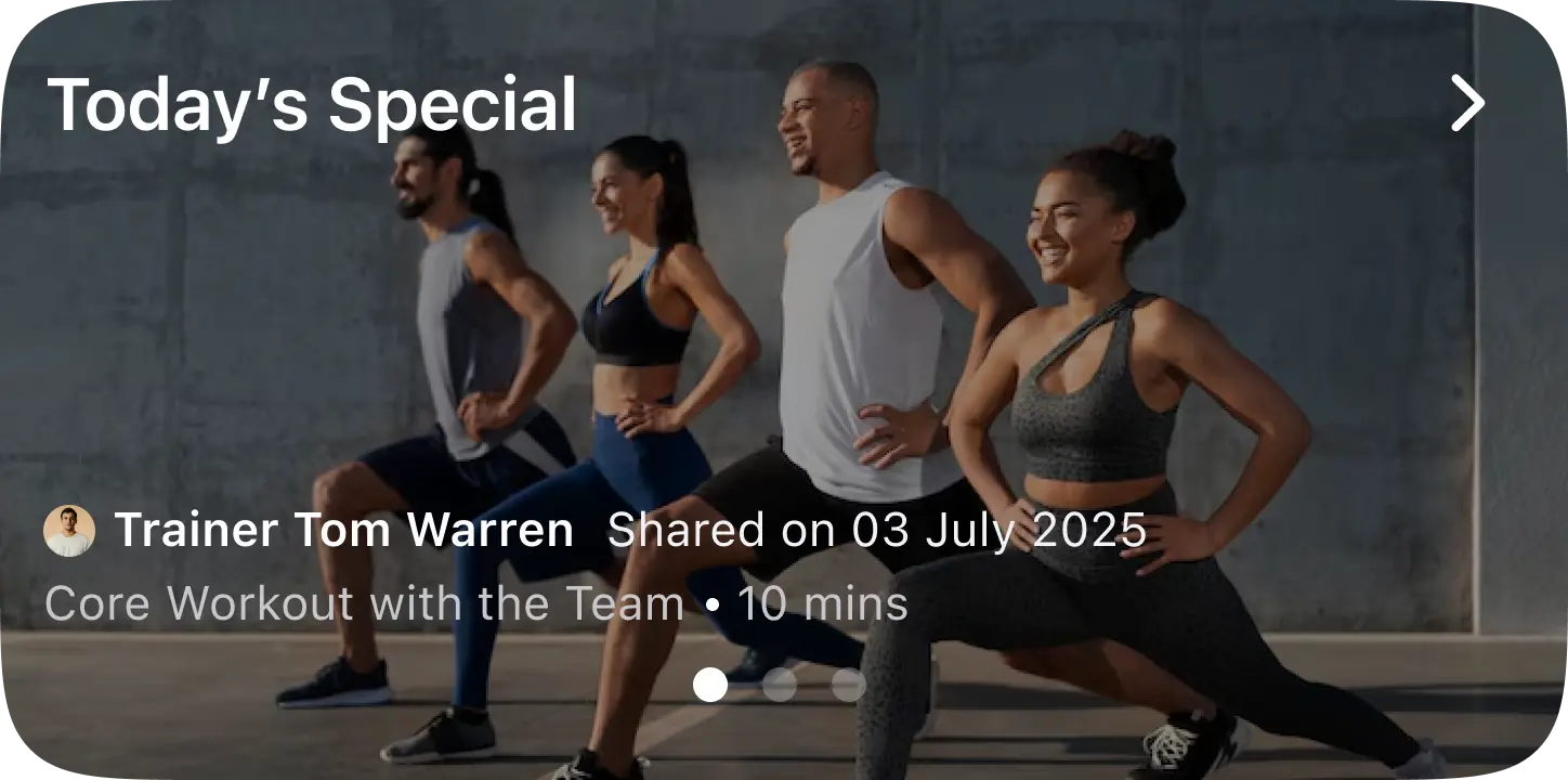
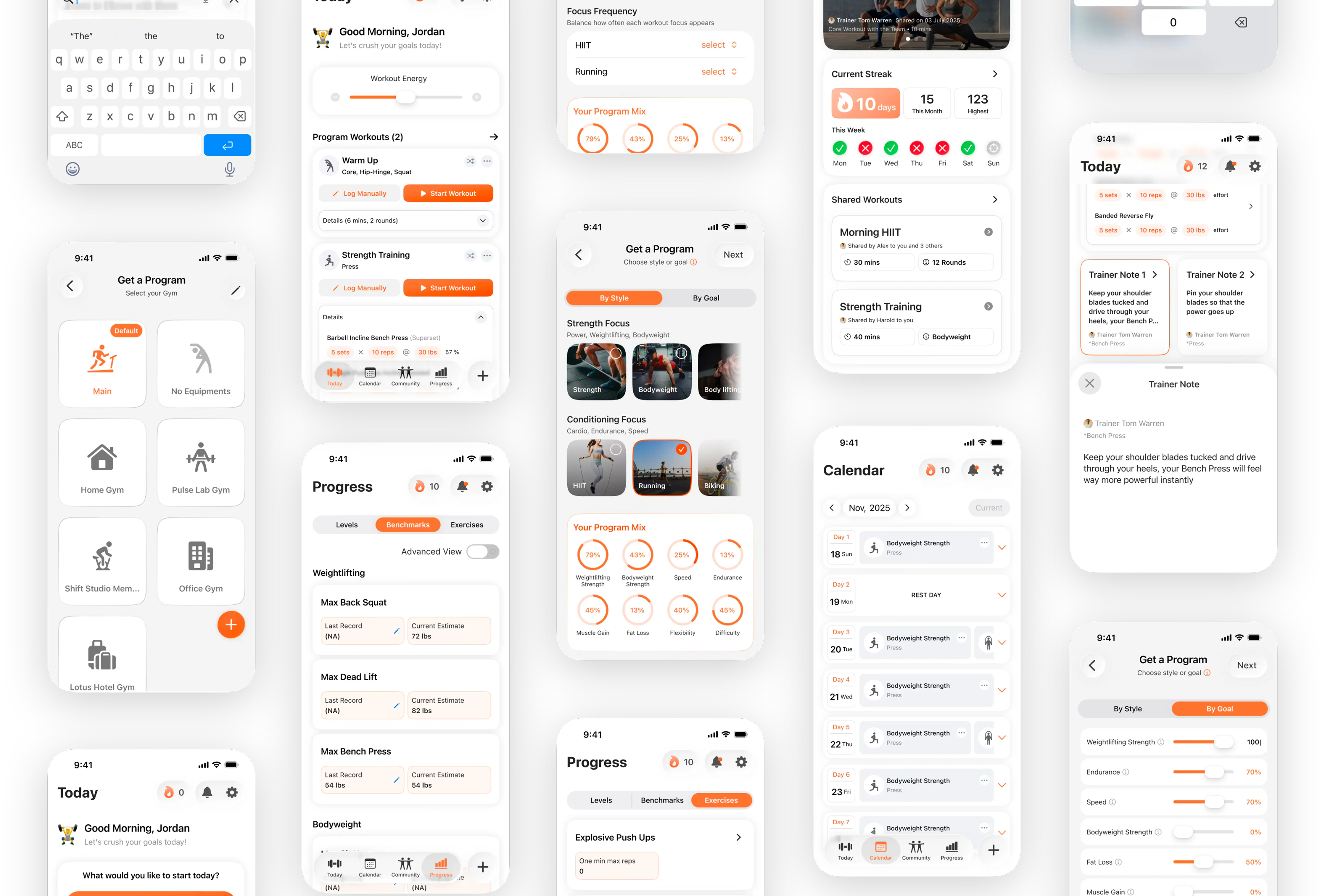
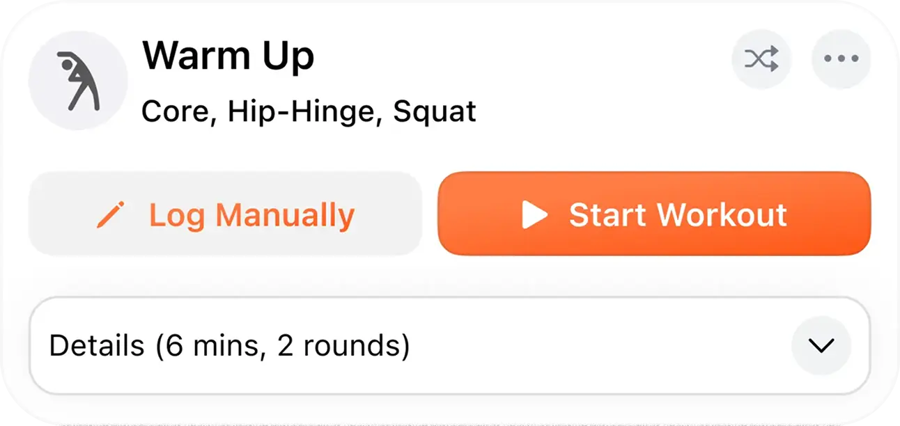
Workout Card
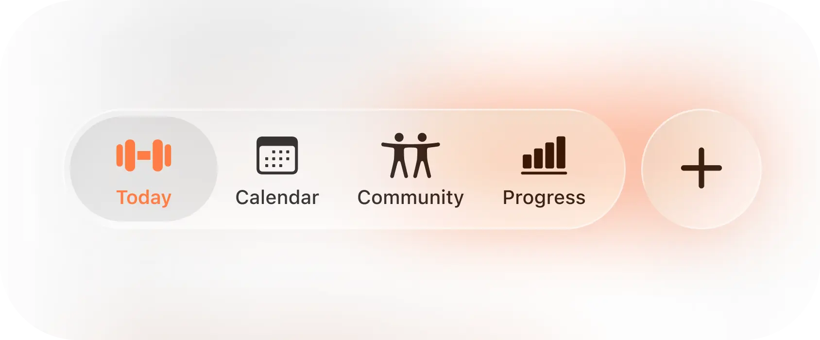
Navigation Bar
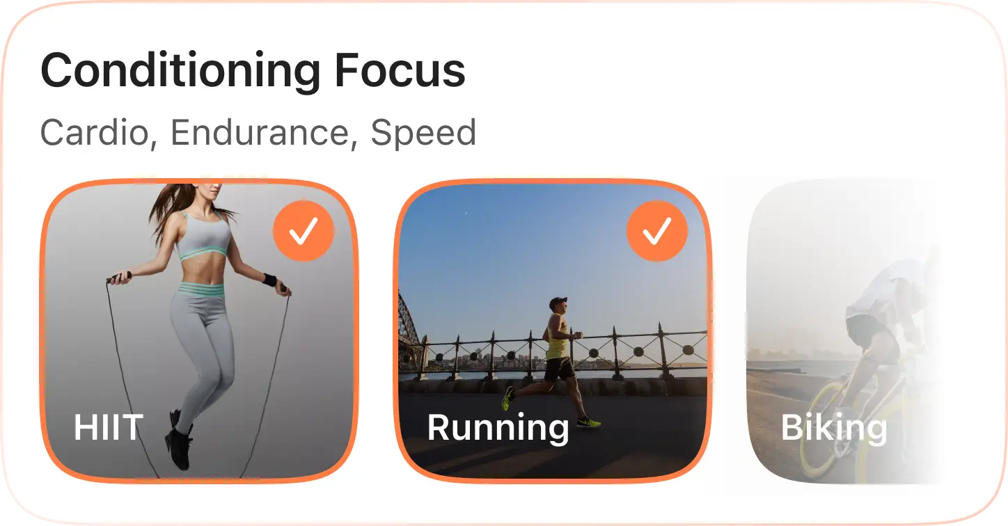
Focus Cards
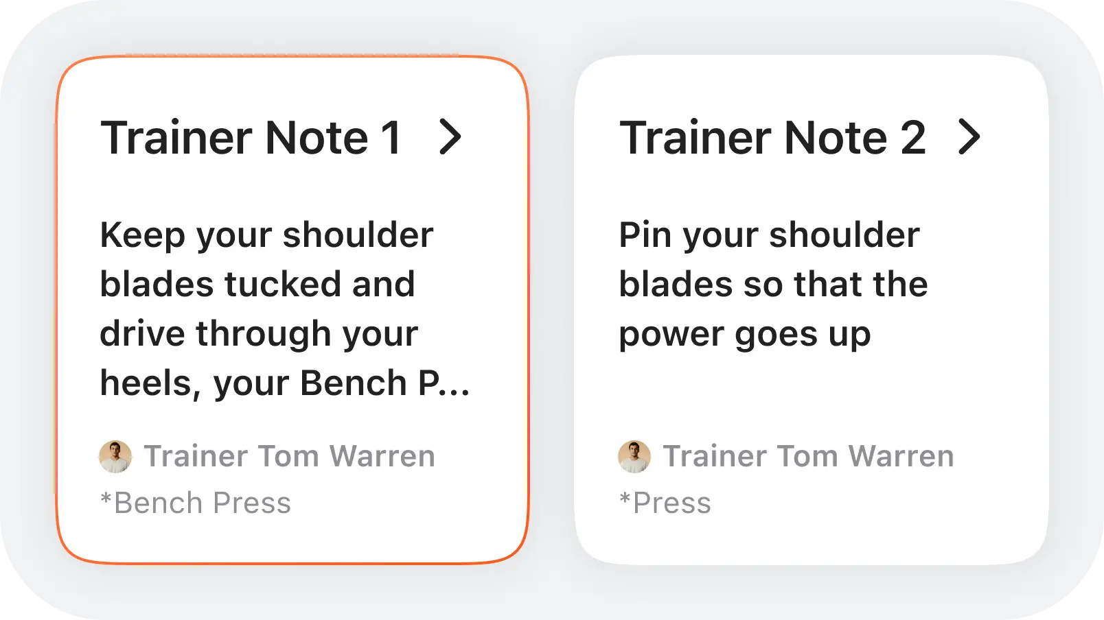
Trainer Notes
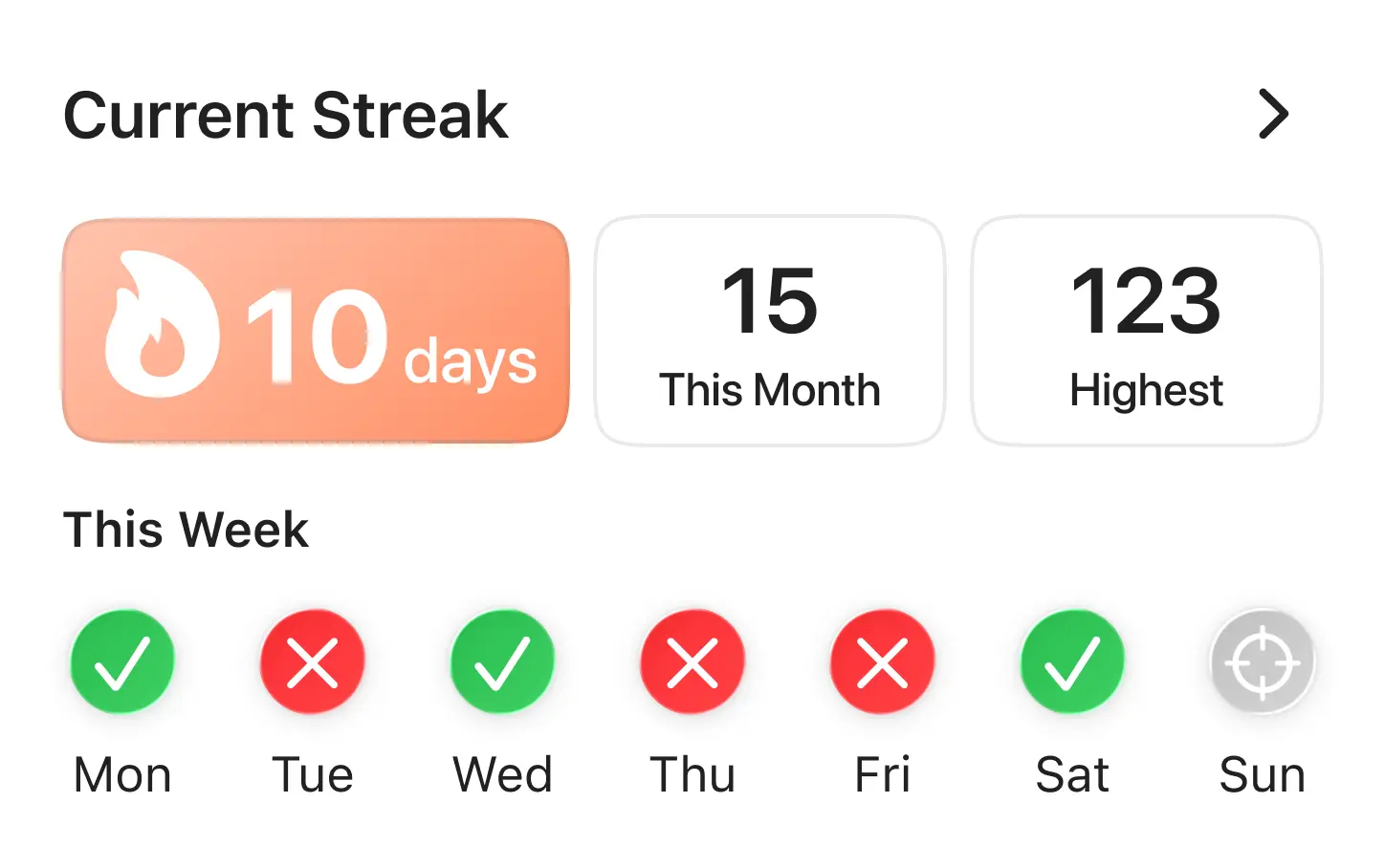
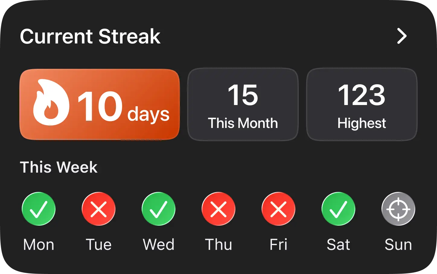
Streaks Column
Trainer Videos
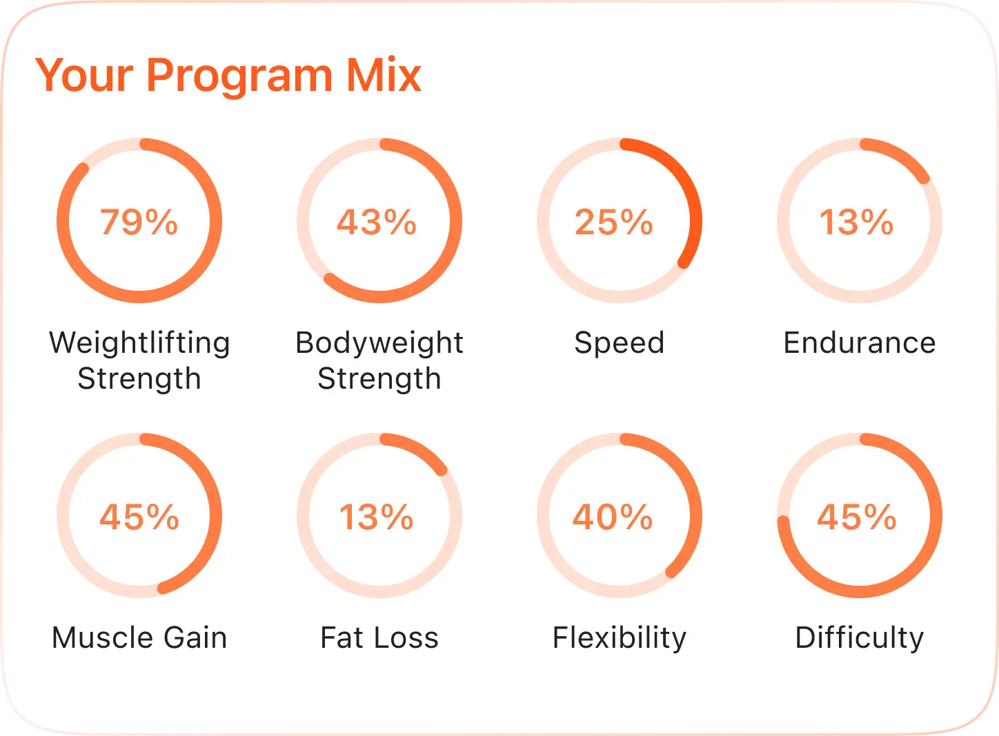
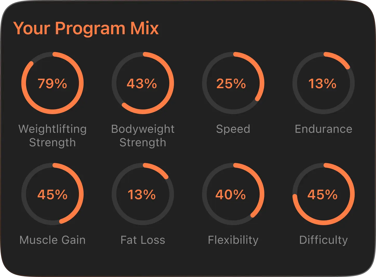
Program Mix Data
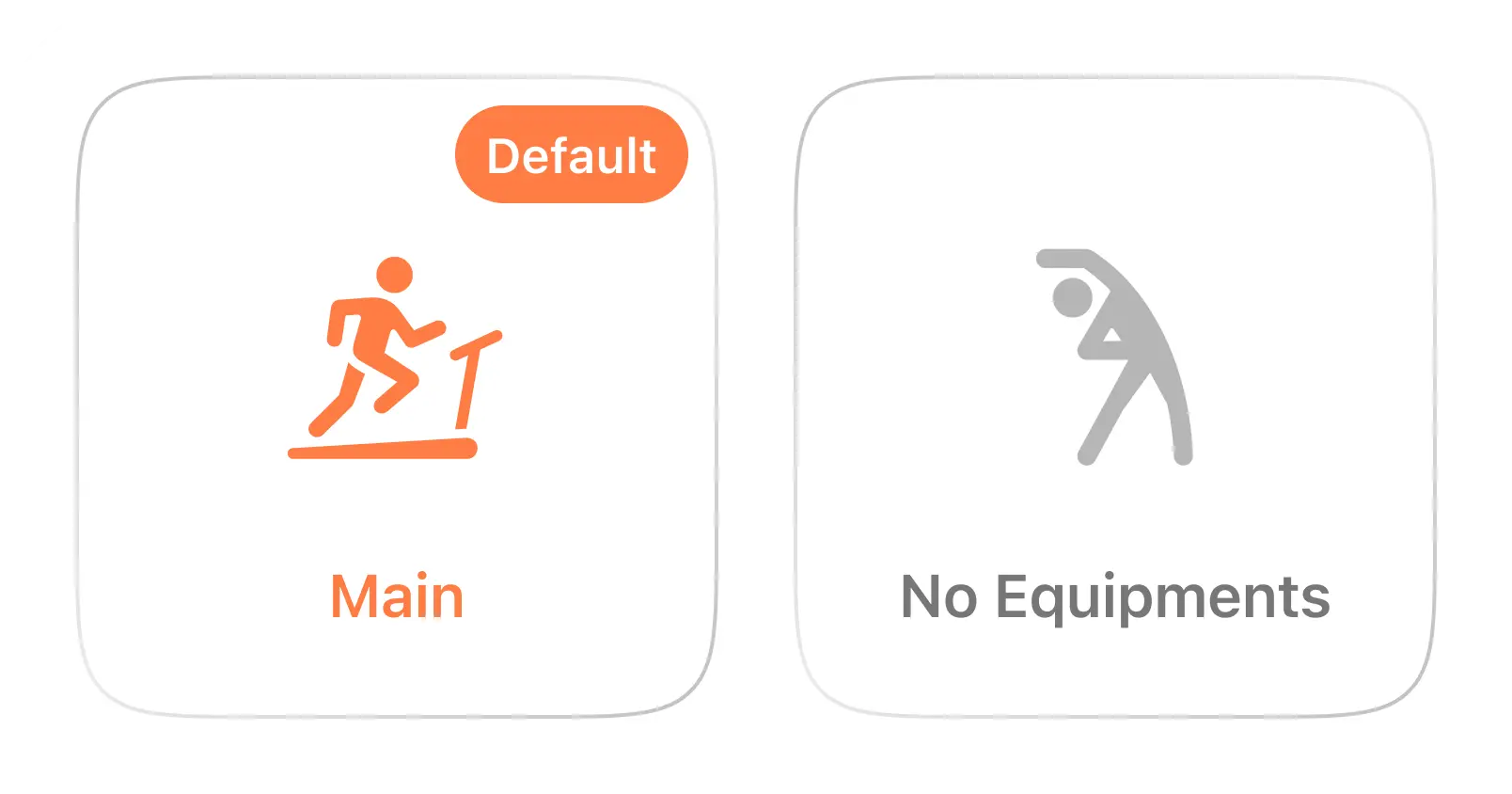
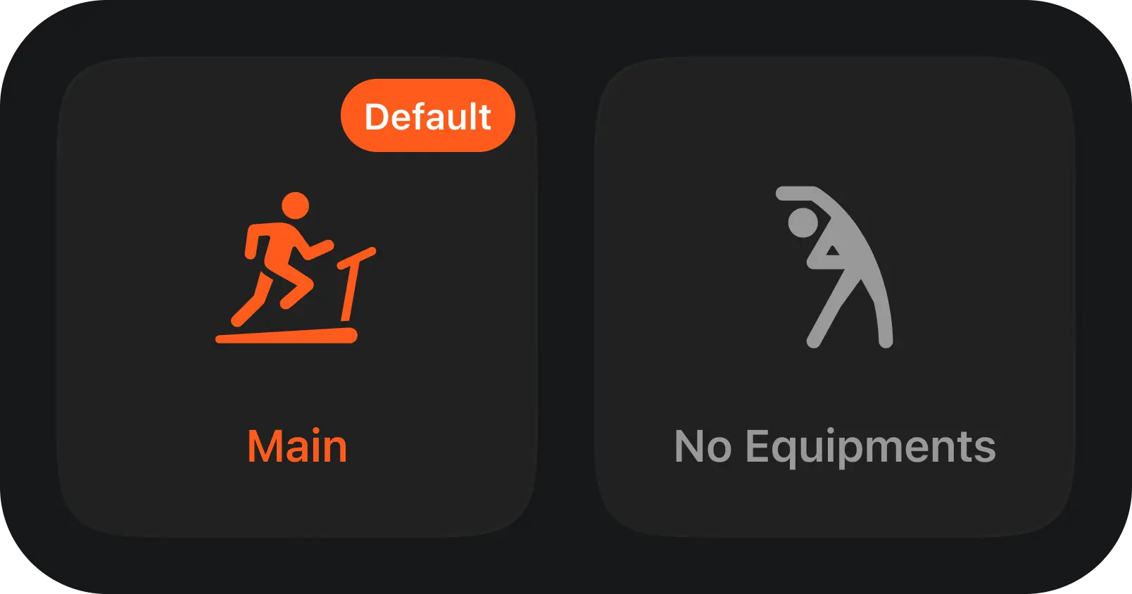
Gym Selections
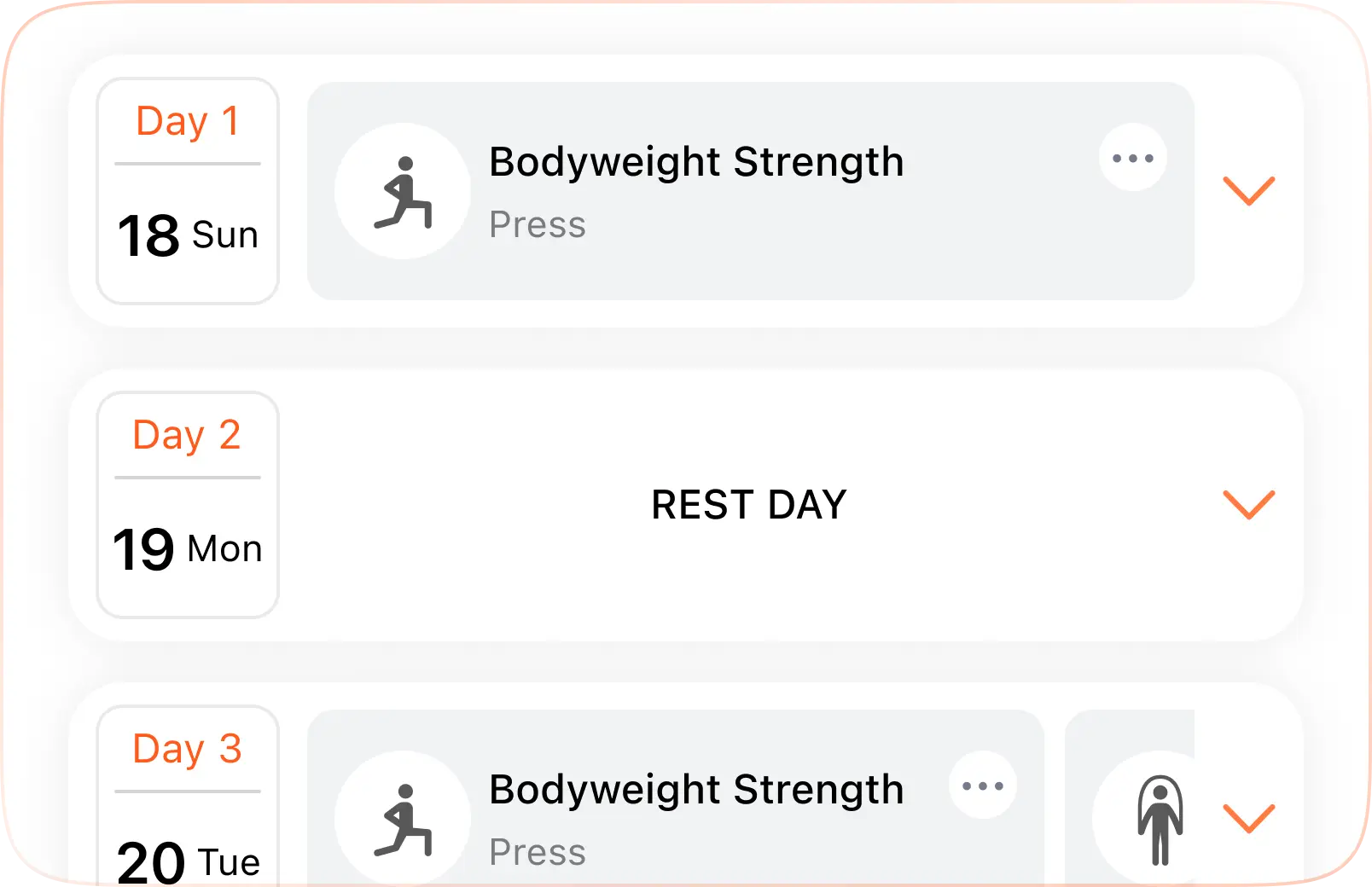
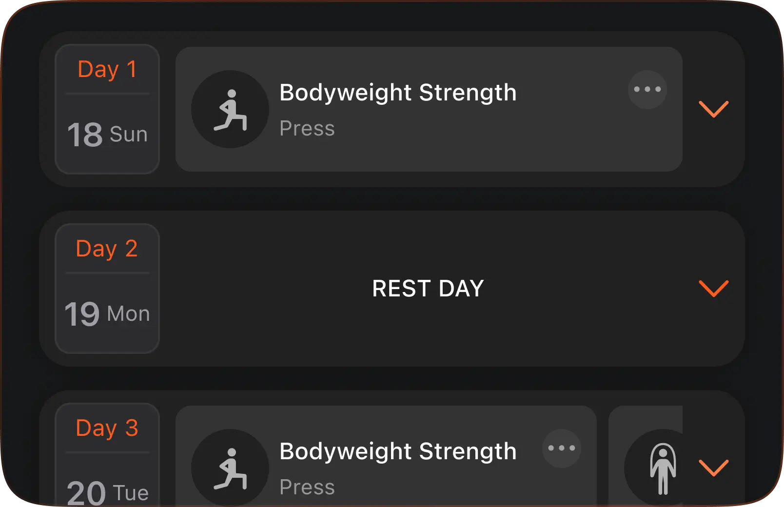
Calendar Cards
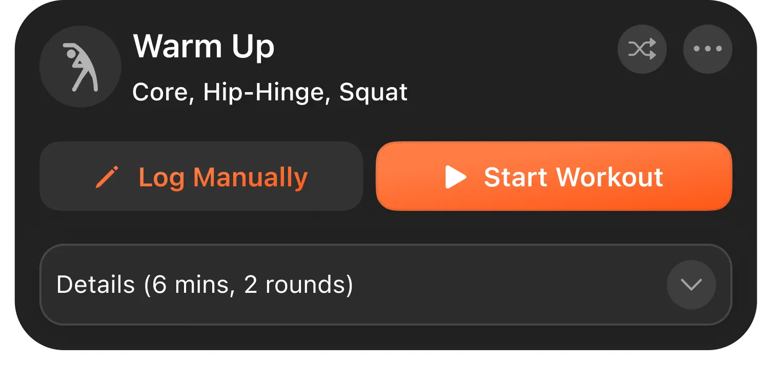
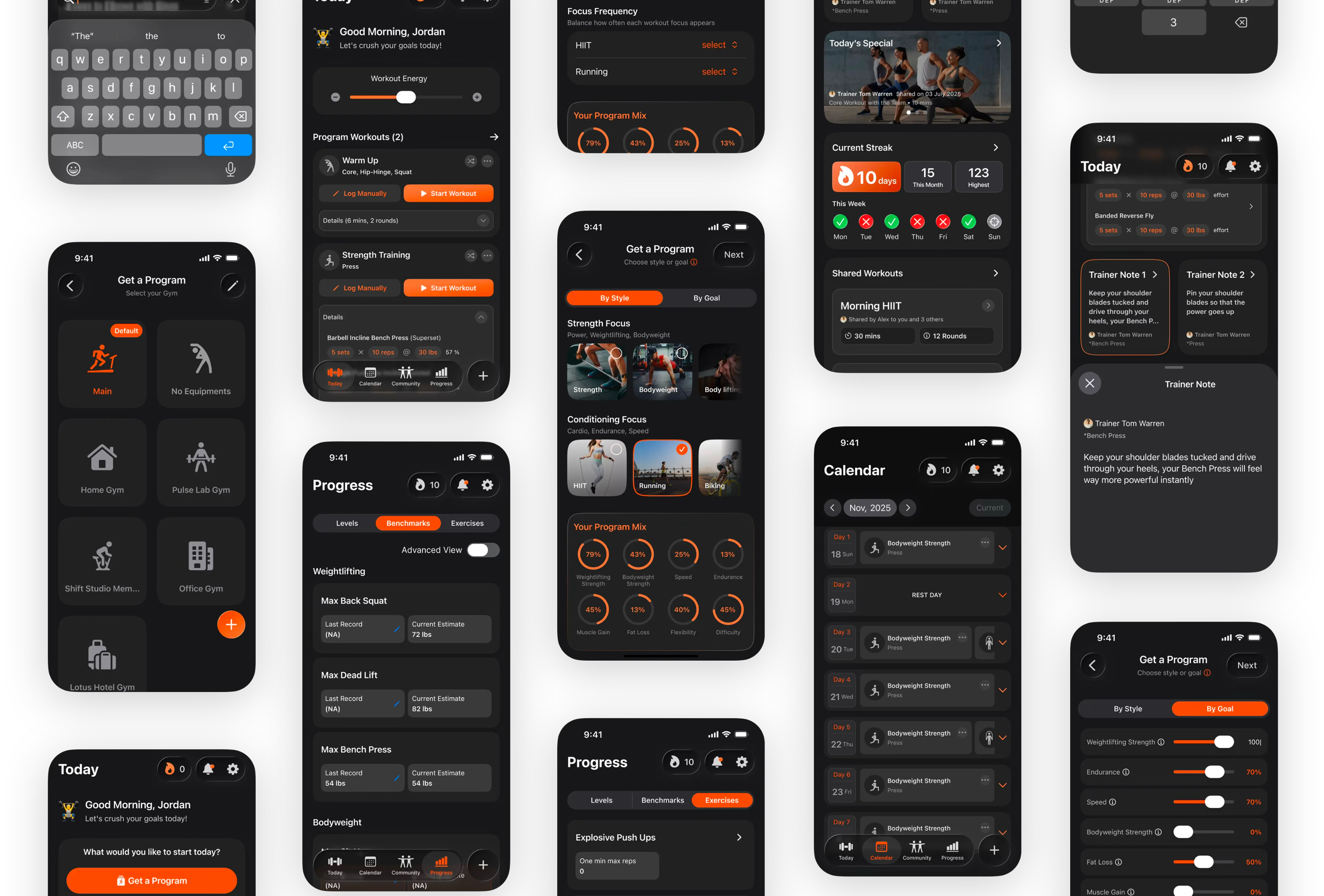
Workout Card
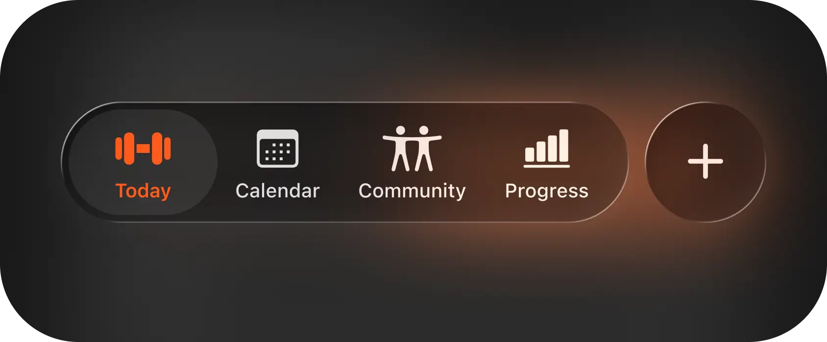
Navigation Bar
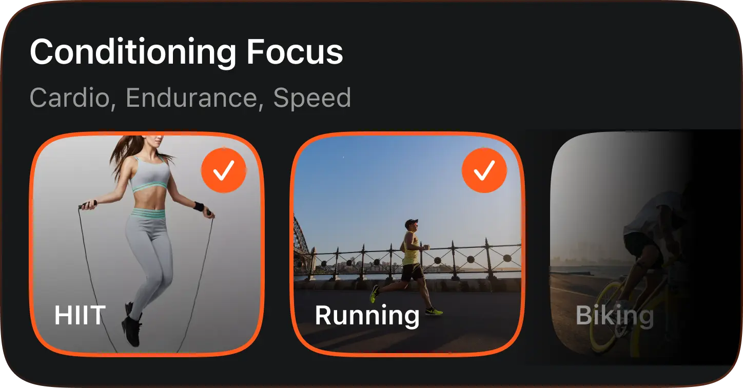
Focus Cards
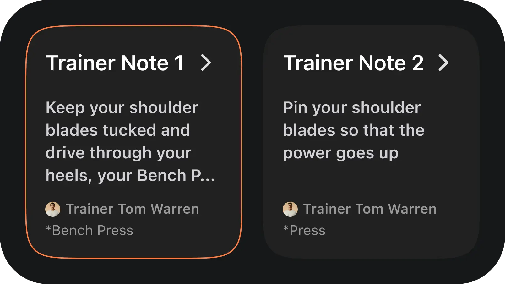
Trainer Notes
Streaks Column

Trainer Videos
Program Mix Data
Gym Selections
Calendar Cards
Knowing when to stop redesigning and start delivering, especially under time constraints was one of the most valuable things I learned from this project.
Working inside an existing system taught me to identify what genuinely needed to change versus what just needed polish.
Time and resource limits forced ruthless prioritization. Some decisions made under pressure ended up being the clearest in the whole project.
iOS 26 liquid glass components started as the trickiest challenge but eventually opened up a set of design possibilities I hadn't anticipated going in.
Stronger visual identity
43 %
Estimated usability improvement across key flows
Consistent component library, all states, variants and interactions documented
Clearer user journey with reduced friction from onboarding through to daily workout tracking
12 x
More consistent UI patterns
Improved usability & task flow
The Ardor fitness app wasn't just a interface revamp, it was rethinking how users discover workouts, track progress and stay motivated. Here are the outcomes after implementing the changes. The redesign gave the product a visual identity and structural foundation it can grow on.